
8 factors to consider when designing signage
A great sign delivers its message effectively, no matter its location. A person could be driving at high speed or taking a stroll at night and still be able to read the sign clearly. Therefore, a great sign is visible even from a distance. The longer people see it, the better chance it has to make an impression. Sounds simple, doesn’t it?
Why do you need a great sign?
Static or digital, creating a great sign is essential for your business, to advertise your location. Your customers will thank you if you have the right sign, but how do you make the right sign? An effective, useful sign fulfils certain requirements:
- Helping both old and potential customers to find your business.
- Letting customers know that they are in the correct place.
- Showing them that you are a professional company.
8 factors that make a great sign
Your signage is the first visual connection between your customers and the company. Not only does it help them find the products and services that they need, but it also assures them that they have reached the right place. The team here at Big Colour Sign and Vehicle Wraps live and breathe signage, so they know what it takes to get it right and they have explained below the 8 most important factors in making an outstanding and effective sign (click on each one to find out more):
- Simplicity and cleanliness
- The right typography
- Contrasting colours
- Colours that blend with the environment
- Unique shapes
- Using suggestive visuals
- White space
- Uniqueness

1. Simplicity and cleanliness
A great sign can convey a lot of information, but it is not advisable to crowd a sign with too many lines of text. Too many words make it difficult to read from a distance and discourages people from reading the entire message. One way to keep a sign simple and effective is to have a headline with only three to five words following it

2. The right typography
Professional fonts have different weights. From regular and bold to black and extended, there is a font type that works for certain parts of your sign. Design studios recommend using classic fonts such as Helvetica, Futura, Arial and Times New Roman. Depending on your type of business, it’s best to avoid using Comic Sans, grunge and script type fonts as these tend to appear unprofessional. It is also best to avoid fonts with serifs (the small flourishes that are added), such as Times New Roman, as they can be harder to read.
At Big Colour Signs and Vehicle Wraps, we try to keep font type to a maximum of two, in order to make an impression without cluttering the wording. You should also keep in mind that using all capitals will make the sign harder to read from a distance. For better readability, use both upper-case and lower-case letters.

3. Contrasting colours
A great sign has a good balance of brightness and colour. A contrast (or lack thereof) between the two affects the readability of a sign and should be carefully considered. Some online tools can analyse colour contrast ratio to check if the colour combinations pass the brightness difference test.
Many designers agree that you can’t go wrong with a black or dark grey font with a light background or a white font with a dark background. Red sometimes works; however, it is associated with danger and emergency and should only be used when appropriate.
Colours that are similar in value are difficult to read, and therefore, should be avoided. Examples of such colours are red and yellow, and green and red. One way to follow this guideline is to look at The Outdoor Advertising Association of America (OAAA) test of 15 colour combinations that were ranked according to readability.

4. Colours that blend with the environment
Knowing where the sign will be located will give an edge when designing a sign. That’s because different environments call for different colours that will provide the perfect contrast. For example, stay away from green if the sign would be placed on a grassy area. A good colour contrast will also make sure that the sign can be seen by viewers even from a distance.
For signs that will be moved across various settings, designers recommend choosing safe colours that blend with all environments. As mentioned, these colours are black, white and grey.

5. Unique shapes
Studies show that human eyes are naturally attracted to unique objects. For example, a circular shape amidst an environment that consists mainly of squares will grab a viewer’s attention. So, at Big Colour Signs and Vehicle Wraps we use this principle to create a sign that is hard to miss. Full-colour graphics will also attract the readers’ attention and adding a border to a sign will help them focus on the intended message.

6. Using suggestive visuals
Visuals, images, are the dominating element in a great sign. Engaging visuals, specifically ones that appeal to the reader’s subconscious, are more potent than functional images. Choose images that will bring curiosity and other strong feelings to the reader rather than some static, ordinary images that don’t stir the imagination. Enrolment in stock photo companies can improve your visual impact, because you will have access to a wide range of legally usable pictures, drawings, art and photos.

7. White space
As the saying goes, less is more, and this is also true when it comes to creating a great sign. Using a white area effectively does not mean wasting precious space. In fact, it has been known that people appreciate signs that aren’t crowded, which takes us back to point number 1 (keep signs uncluttered and simple).
There is always a venue for more information, and a good sign is not it. Instead, it should point the reader in the right direction to find the information (or place) they are looking for.
A sign that is crowded with too many words is hard to read. Therefore, for optimal readability, 30 to 40% of the entire sign should be left as white space.
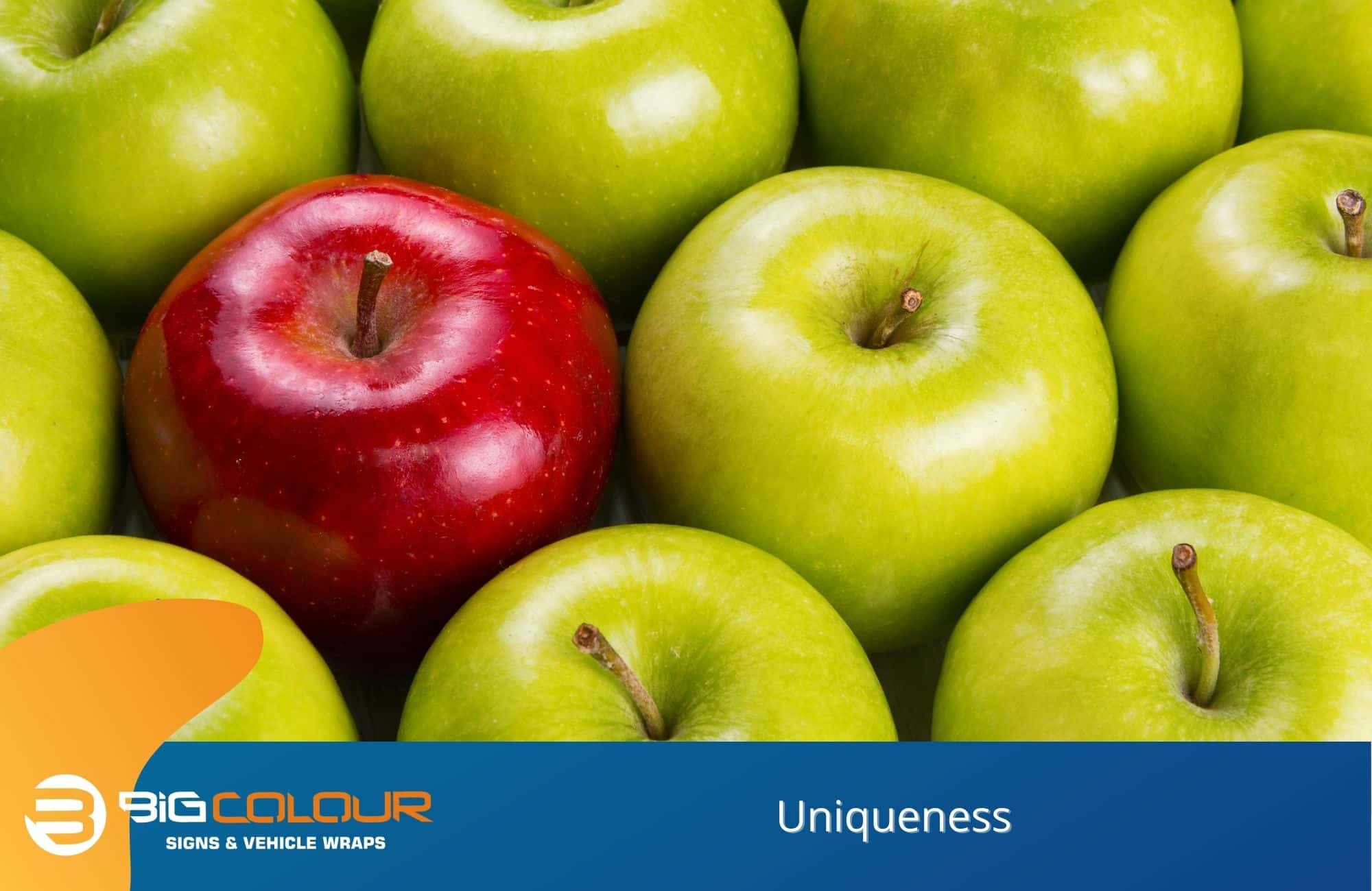
8. Uniqueness
Doing things differently with your sign can be fun. Don’t be afraid to try new colours or images for that wow factor. Play with jokes or puns or create your own memes. A catchy phrase would stand out, and you’ll be having fun thinking of one!
Promote your business with a great sign from Big Colour Signs and Vehicle Wraps
At Big Colour Signs and Vehicle Wraps, we believe that a great sign reflects a great business, which is why we’ll help you create a sign that best represents your company. We already serve bike shops, surf shops, skin clinics and more in Newcastle, Lake Macquarie and the Hunter Region.
We also offer car wrapping that guarantees increased visibility for your brand. You can likewise come to us for 3D and illuminated signs for shop fronts and fit-outs, PVC banners, as well as trade show signage and other portable sign solutions. Email us for a quotation at admin@bigcolour.com.au or call us at (02) 4969 5700 today to learn more about the ways we can make your sign speak louder than the rest.